How did you use media technologies in
the construction, research, planning, and
evaluation stages?
When starting our coursework we knew that we had a lot of research ahead of us and crucial information we would need to find out about the horror genre as this was our stimulus. When we were told that we would have to produce three media products which were based around the horror genre we thought it would be a good idea to get a better insight into the genre of horror. So we decided that we would research teaser trailers from the horror genre, as well as other types of teaser trailers because we had to distinguish the difference between a trailer and a teaser trailer.
We used YouTube to help us with our research and watched trailers including ‘the eye’, ‘Freddie vs. Jason’, ‘paranormal activity’ and many more. These helped us to categorize the trailers into sub genres which meant that we could look more into depth in the different types of horror. The YouTube videos also helped us recognize the difference between trailers and teaser trailers, this information was vital as we have been set to specifically create a teaser trailer, so by knowing the generic conventions we were able to use this to guide us with our production. We noticed that teaser trailers give out far less information and don’t reveal too much of the plot. They are also less likely to use real footage from the film, and can be released over a year before the actual film is released and also they tend not to use any dialogue. There main aims are to tease the audience the audience rather than inform the audience. We used film websites and Wikipedia to research different horror films, and to see if there was a difference between old and modern horror. http://en.wikipedia.org/wiki/List_of_horror_films:_2010s Wikipedia gave a list of horror throughout the different years. Although Wikipedia is not always reliable, we also used Google after finding the name of the films to research into them, and YouTube to watch the trailers.
 We also watched DVD’s in our own time which contained trailers and we looked closely at mise en scene, editing, lighting and sound. We have to understand the conventions fully to help us with our project. Our textual analysis’ helped us in our preparation, as analysing media products that we would have to create in full detail also helped us with our knowledge on conventions of teaser trailers, posters, and magazine covers. When we had completed our textual analysis we published them on our blog, and then all had a look at each others to share what we had found with each group member. For our textual analysis’ we used websites such as http://www.empireonline.com/magazine/ , http://www.totalfilm.com/magazine , this was to find magazines to analyse, which would also give us inspiration for our magazine front cover. Google was a relevant search engine that was use constantly throughout our research and planning as it allows us to access anything on the web including, questions, information and images.
As the genre of our trailer is for horror, a typical convention would be blood and gore, so research into make up effects that we could possibly use gave us ideas, and explained how to achieve the effects. http://www.zombie-makeup.com/2009/03/04/creating-a-large-wound-tutorial/ was one of the websites we used as the tutorial explains step by step on how to create the wounds, it also shows an example which makes it easier to follow and copy. As our original idea was going to contain a lot of wounds and make up effects we took time to experiment with the make up resources available and started to have test trials. We wanted the effects to look as real as possible so we had to experiment with it to find different techniques that we could use to make it look realistic.

 |
| Using Facebook To Arrange Meetings |
Before we started filming we used Facebook, text messages, and blackberry messenger, to communicate outside of college. We would arrange to meet up to discuss ideas and film. Planning our project and allocating roles within the group made it easier for us to plan a schedule. Although there were a few misunderstandings and disagreements within the group when it came to the filming process, as a group we pulled together and made sure that we all had equal input. We used the cannon SLR camera to record the footage and take images. The immediate playback meant that we could look over the footage straight away, so when doing test shots we could try out different angles and lighting effects to see which worked best. Practising using the video camera meant that we could familiarize ourselves with the settings and learnt new skills such as using the focus lens and white balance.
 |
| Using Blackberry Messenger To Organise Filming |
 |
| Communicating Via Text Message |
 |
Using Facebook Inbox meant that we could still work together as a group outside of college as all 4 members have facebook accounts and therefore this was the place we would meet up and make arrangements outside of college and during holidays.  The production process involved the making of the teaser trailer Institution. During the production stage a number of equipment was used which included using a Canon EOS 7D, lights, tripod, card readers to compact flash cards and a steady cam. Using a canon camera was needed to film the trailer. We were fortunate to have such high quality equipment at hand. Before filming the trailer we had to make sure that we knew how the camera worked since it was delicate and if we used the camera wrong this may have resulted into bad filming which would include bad lighting or footage being out of focus. Before we starting filming we used a Canon EOS7D full review as guideline on how to use the camera. This included information like operating the flash on the camera and setting up different types of lighting. The production process involved the making of the teaser trailer Institution. During the production stage a number of equipment was used which included using a Canon EOS 7D, lights, tripod, card readers to compact flash cards and a steady cam. Using a canon camera was needed to film the trailer. We were fortunate to have such high quality equipment at hand. Before filming the trailer we had to make sure that we knew how the camera worked since it was delicate and if we used the camera wrong this may have resulted into bad filming which would include bad lighting or footage being out of focus. Before we starting filming we used a Canon EOS7D full review as guideline on how to use the camera. This included information like operating the flash on the camera and setting up different types of lighting.       When filming we had to make sure that we had a variety of shots included and that we took many takes of the same shot. Various shot types Counting in and out was a technique we used we when filming. The way in which it worked was counting up before we started recording, and down before we finished recording a shot. The purpose of this was to make sure that the actress was ready to get into action and character and that nothing was cut out during the recording.  Lights   We established a suitable white balance by using the Auto white balance on the camera however we did come across some issues , when filming we realized that when moving away from the subject we lost our level of lighting and as a result made our footage not look like an authentic teaser trailer after much deliberation we tackled the problem by carrying the lighting as the camera moved, and it worked, we were pleased to see our technique worked. However to achieve the horror convention of low key lighting we later on had to manually dim the lights used for filming. Tripod  A Tripod was used during filming. The reason for us using a tripod was to make sure that we had steady footage since it was used as a stand. By using a tripod the footage we filmed was still as opposed to the footage we would have had if we used a hand held camera. However, we approached the task of having to hold the camera, we had to face the facts that parts of filming will be shaking but disguised it by turning them into point of view shots, there fore we would not be penalized for shaking shots because we filmed in a way where by the audience feel as they were in the same room as the killer and install a fear factor. In addition we found out in feedback from our research that our ending shot and soundtrack was effective in scaring people, this can be seen in the footage of participants watching the trailer. A Tripod was used during filming. The reason for us using a tripod was to make sure that we had steady footage since it was used as a stand. By using a tripod the footage we filmed was still as opposed to the footage we would have had if we used a hand held camera. However, we approached the task of having to hold the camera, we had to face the facts that parts of filming will be shaking but disguised it by turning them into point of view shots, there fore we would not be penalized for shaking shots because we filmed in a way where by the audience feel as they were in the same room as the killer and install a fear factor. In addition we found out in feedback from our research that our ending shot and soundtrack was effective in scaring people, this can be seen in the footage of participants watching the trailer.We also found out that in order to achieve certain shots we would have to use a track; a dolly is used to follow the subject being at the same pace and direction to give the effect of being there. In our trailer we used the tracks to mount the camera on the move closer and away from the killer to give a frightful effect, in doing so we as a group experimented with speed and lighting. Card readers were used to compact flash cards. This was because we had to transfer our footage from the camera onto the Mac computer in order to do some effective editing.  Photography Before any photographs were taken as a group we discussed the vision and direction we wanted to create for our magazine front cover and movie poster, we took all the ideas of the group members and created sketches as a visual aid to help us on the day of shooting in regards to the layout. Photography was used in taking behind the scene pictures and for the making of the magazine front cover and poster. The photography aspect of production included us using the Canon EOS 7D Camera, a Flash Kit, Soft Box and the Trigger. All of these different media technologies and equipment were needed in order to take some effective pictures. The canon camera was the main source of equipment used since it was needed for the actual taking of the pictures. When taking the pictures we had to ensure that the camera settings were correct. This included making sure the camera wasn’t out of focus and following the rule of thirds principle which we learnt in AS Media Studies. When taking the picture we found out that our back drop was blue because of that, it meant that when editing the main image we would have to make sure the colour we used to replace the blue which was black looked realistic and not blatantly manipulated by Photoshop, even though we had visual aids as to what poses we looking to photograph we also improvised some of poses in the images taken which ended up coming out better then what we had initially planned none the less having the sketches did help us to get started off with what look we were aiming for. We had experience of using the canon camera from the making of the trailer and previous lessons. In fact we found it a lot easier to take pictures with the camera compared to filming since the filming process was more complicated than taking different pictures. During our photography session we had to look back on examples of film magazine front covers from majors such as “Empire”, “Entertainment weekly” and “Film” and were fortunate to find killers in films and see whether they stayed in character, make up and costume or did they come as themselves, we decided that our killer would stay character because it would allow our target to recognize the film as well as maintain continuity. We used high key lighting on the subject but when editing the layout of the front we used a dark colour scheme consisting of black and red. Which followed the conventions of real media film magazines e.g Empire. The shot sizes used for our pictures were medium shots and medium close up shots, ultimately we ended up using a medium long shot. For our Film Poster we also had visual aids of sketches as preparation before shooting as well as examples of previous film posters, we found out that most film poster followed a theme of close up shots with low key lighting, or high key lighting as in a bright white we there took many close up shots and different angles such as high and low angles to be more eye catching similar to real media products, but with our own original outlook on it. What made sure that the convention of a killer having a prop with was followed whether it was a weapon or victim or killer had a teddy bear and with that had make sure that their was connection between which is why with our final product the killer is looking into the eyes of the teddy bear the non verbal communication denotes insanity. On purpose we decided to show only half of the killers face in most cases of horror they tend to not show the face of the killer but instead in parts such as a hand or eyes, therefore we decided to create an element of mystery by only show half of the killers identity.  During the production stage as well as video and filming photography was also essential. Photography was used in taking behind the scene pictures and for the making of the magazine front cover and poster. The photography aspect of production included me using the Canon EOS 7d camera, a flash kit, soft box and the trigger. All of these different media technologies and equipment were needed in order to take some effective pictures. Print Production/Advertising : Movie Poster and Movie Magazine Front Cover Creativity is a key part of this project, and in order for us to have transferred our creativity into practical photography, we needed our inspiration and planning materials with us to put our ideas into our photography. Having to film from different angles and with different focus points was part of the visual ideas that we wanted to put into practice for our trailer. Using the Canon EOS 7D Digital SLR camera helped us convey our creativity into photography. After researching into how to use an SLR camera, and gaining knowledge on the benefits of using that camera we found it easier to practice our ideas. As our trailer is based on mental instability, we thought it may be a good idea to film from unconventional angles to connote the main character’s unstable mind. This was one of the ways in which we tried to implement our ideas into practical photography. During production we used different forms of lighting. majority of the time we used the Kino Fio video lights but we also sampled the spotlights. We continuously used the flash on the Canon EOS 7D camera as well as addition lighting and flash kits. (INSERT NAME OF FLASH KIT) We positioned the lights directionally so we could accurately achieve the low-key lighting. We practiced different directions away from the subject during photography for our magazine front cover and horror film poster. We found that some pictures came out either too bright or too dark, and after several attempts we found a good balance of lighting. We used high-key lighting for our magazine front cover main image and low-key lighting for our horror film poster.  High-key lighting  asymmetrical, low-key lighting The image software used to manipulate our main images was Photoshop; versions ‘CS3’ and ‘CS5’ were both used. After using the Internet, particularly “Youtube” to research successful use of both programs, they were both widely used in the post-production stage. Other software used for the manipulation and editing of the ancillary texts included http://www.dafont.com/ , which we used to download our chosen fonts for use in our final products. During the production of our ancillary texts we had to be aware of health and safety issues whilst filming. Becoming media producers meant we had to act professionally and safely when dealing with the equipment and we had to be continuously considerate of the well-being of all those involved with photography. We had to be constantly aware of the tripod rods, wires in peoples’ pathways, ensuring the cameras and lights were steady at all times and everyone involved in the shoot behaved responsibly and professionally e.g. no running in the studio, no food or drink around equipment etc. We researched different media products throughout this task. Our textual analyses and individual research allowed us to gain sufficient knowledge regarding real media texts, and through this we learned the typical conventions of film magazines, and horror posters. The main technology used when we aimed to follow the conventions of magazines and film posters was the use of search engines on the Internet, the main search engines used were “Yahoo!” and “Google”.  Post Production Using Final Cut Pro Our aims: How we used it:   To cut on Final Cut Pro we used the keyboard and mouse to a considerable degree. Cutting was a key part of the editing of our teaser, and was even used to create special jump effects. The keyboard keys 'A' and 'B' as well as the mouse allowed us to cut during the playback of our footage. The letter 'B' would produce the 'Razor blade' tool, and once we had cut where necessary, key 'A' would produce the arrow key where we could select the parts we wanted to cut then press 'backspace' to delete it.  Video Transitions It was fairly straightforward to add video transitions. Clicking the 'effects' tab at the top of the page produces drop down list where we selected 'video transitions' followed by the 'dissolve' and then proceeded with selecting the right transition then dragging it onto the sequence, . We used the 'Cross Dissolve' and 'Fade In Fade Out Dissolve' transitions through out our teaser project. Changing the speed When trying to reduce the length of our teaser to our target length of 45 seconds, other than cutting we had to alter the speed of the frames. Using a "command + J" shortcut, we could change the speed of the frames. The default frame speed is 100%, by entering any percentage higher than this would speed up the speed, so the average percentage we entered to speed up some of our frames was at 120%, with the highest being 144% to make the end of our teaser quick , scary and hard-hitting.  "Command + J" = Change Speed  Special Effects Using the 'cut'(B) tool we created a"flicker"/ "Jumpy" effect on our teaser trailer footage. This was done to make it appear scarier, jumpier, and overall give it a unique look. This effect was moderately used in (0.17-0.38) in our Teaser. Accessing the 'Video Filters' folder within our Final Cut Pro project, then selecting 'Image Control' followed by the 'Tint' option allowed us to adjust the colour of our footage. We tinted our footage using the colour black, with an opacity of 40%. This was done to make the teaser appear visibly dark, which if successfully achieved, would connote darkness and fear for our audience and correspond with our given genre.  Accessing the tint folder  Choosing a 'tint' shade. Using Photoshop  CS3  CS5 Our aims For our magazine front cover the main aim was to slightly manipulate the main image to make it appear darker or scarier, so audiences know the actress in the image is from a horror film. We also needed to add cover lines, a bar code, a masthead and generally make it correspond with the typical conventions and basic expectations of film magazines. For our poster, similarly, the main aim was to manipulate the main image to give it a dark and scary appearance. We wanted to manipulate it a way in which audiences will look at the poster and not only recognise the Horror genre, but to also be affected by image. In order to achieve this effect we needed to give our poster an appealing look. So the general aim was to use suitable effects and typography to give the poster a striking appearance. We also needed to add credits to the bottom of the poster so it is recognised as a film poster. How we used it For the magazine front cover:  We used the text tool, font 'century gothic', to add all of our coverlines and other text to the front cover image, we needed to do this to make it recognisable as a magazine front cover. The text tool was also used to add our Masthead and the film title, Institution. We could only add these after the downloading the fonts from http://www.dafont.com/ and then installing them onto the Mac we used for this project.  For the key image manipulation, various Photoshop tools were used to help us transform the raw image into a Movie magazine front cover promoting a horror film. The tool used predominantly in the development of the magazine front cover was the 'lasso' tool as it allowed us to select areas of the image in which we wanted to either delete, colour, or add an effect to. An example of this is when we selected the eyes of the actress in the image, then proceeded with the use of the "Liquify" filter which manipulated the appearance of the actress' eyes making them appear lost and scary.   Black and white colour adjustment  black and white colour adjustment  Accessing black and white colour adjustment  De-saturation  'Replacing' previous background with colour  Using the 'Healing' brush tool  Using the 'Lasso' tool 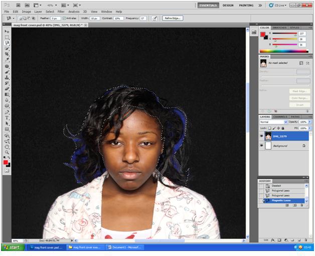 Using the 'Lasso' tool  Using the 'Patch' tool For the Horror Film Poster:  The main aim for our horror poster was to make the poster look scary. Using Photoshop we created a number of drafts for our horror film poster, mainly changing the background colour. We finalised with a white-based poster, which we were unsure of due to horror posters conventionally being dark-coloured. However we chose white as the dominant colour and we felt the outcome was successful. We used the paintbrush tool to colour the actress’ surroundings white, making only her and the props visible. We did this as we felt the colour white linked well with the theme of madness in our horror film, primarily because people suffering from extreme mental illness are kept in a white room. Therefore the colour would connote madness when linked with the plot and the character’s composition and facial expression. We mildly de-saturated the character and her props then proceeded with using the contrast filter on Photoshop to brighten the character as well as her costume and props so the image appeared to be whitewashed. This corresponded with our colour scheme across our products, and also helped the film title stand out more. Using the lasso tool we selected around the actress and her props, followed by 'feathering' which smoothed the selected edges, and then duplicated the layer by using the keyboard shortcut CTRL + J. We adjusted the exposure and colour levels of the duplicated layer to make the blood stains on the character and her props stand out. After doing this, we selected the two layers then merged them using keyboard shortcut CTRL+E. To continue, we then adjusted the fill and opacity of the subject to give the image a washed out effect. After the image was manipulated to the extent in which we were pleased with, we added the film title, credits and actress name. We had to download the “Steel Tongs” font from www.dafont.com as it is the most suitable font for film credits, and this complied with the conventions of film posters. Taking another look at the poster we felt more could be done, so we used the sponge tool to saturate the blood stains on the teddy bear. Although this slightly drew more attention to the teddy bear than the actress, it helped display the blood more clearly, making the genre more recognisable. Drawing more attention to the teddy bear also would help audiences recognise the theme of childhood in our horror also. The use of Photoshop CS3 and CS5 helped us effectively transform our dark asymmetrical raw image into a bright but scary-looking horror poster. Examples of our use of Photoshop for our Horror film Poster  'Feathering'  Colouring the font  Adjusting the exposure  Adjusting the contrast Other software used Acoustica Mixcraft 5.1   The "Wine glass sound we used"  adding a sound file  Musical Typing iTunes |